Cafe DAON · Branding

—— Scroll Down

—— Overview
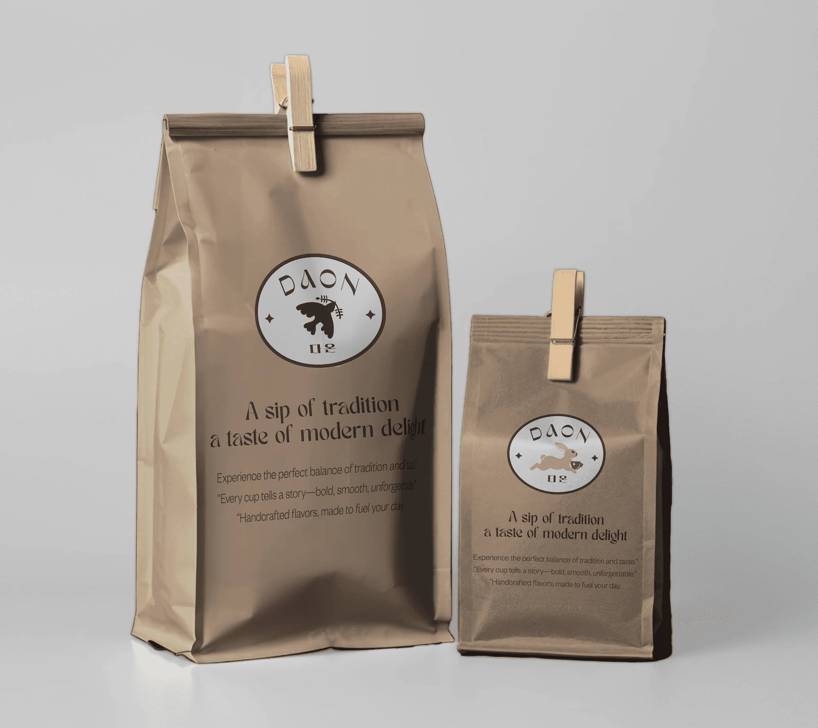
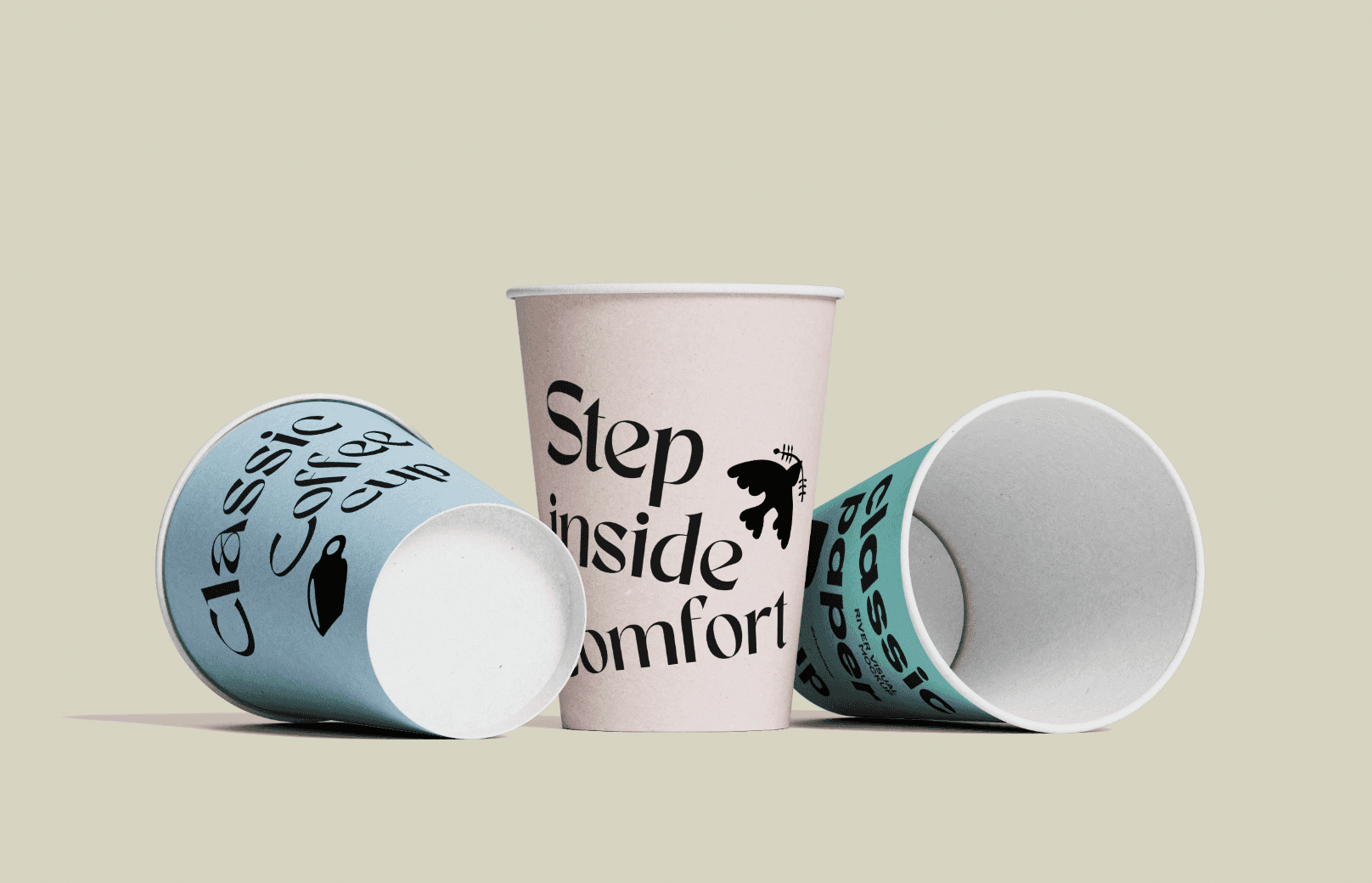
In Korean, “Daon” (다온) means “a valuable guest is coming.” Inspired by this, the brand features the magpie and rabbit—symbols of warm welcomes and good fortune. More than just a café, Daon embodies cultural heritage and creates a space where every guest feels special.
Client
Date
Service
Tool

—— Metric Results · August 2026
Content Reach in a month
Daily reach of users in a month
Average of views per user
—— Final Design




—— Project Goal
After several meetings, the client requested that I incorporate traditional Korean design elements to showcase the rich cultural heritage of Korean desserts and beverages.
—— Brand Design Principle
After client meetings, I gathered visual inspiration, persuaded stakeholders, and developed a style tile to establish the project’s visual direction—ensuring alignment between the brand’s aesthetics and the client’s vision.

The brand creates a warm, inviting atmosphere using rich browns, dark red, green, and natural wood tones to enhance comfort and authenticity—encouraging customers to relax and enjoy their time.
—— Sketches
With a clear direction, I explored and refined multiple logo and typography concepts to create a final design that captured the café’s brand identity and essence.


—— Logo Design
With a clear direction, I explored and refined multiple logo and typography concepts to create a final design that captured the café’s brand identity and essence.


—— Brand Color System
I established a strong brand identity by using colors that represent uniqueness, engagement, and functionality.

—— Interior Design
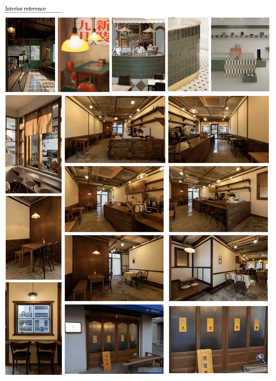
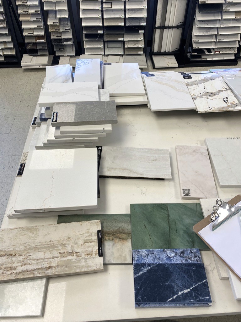
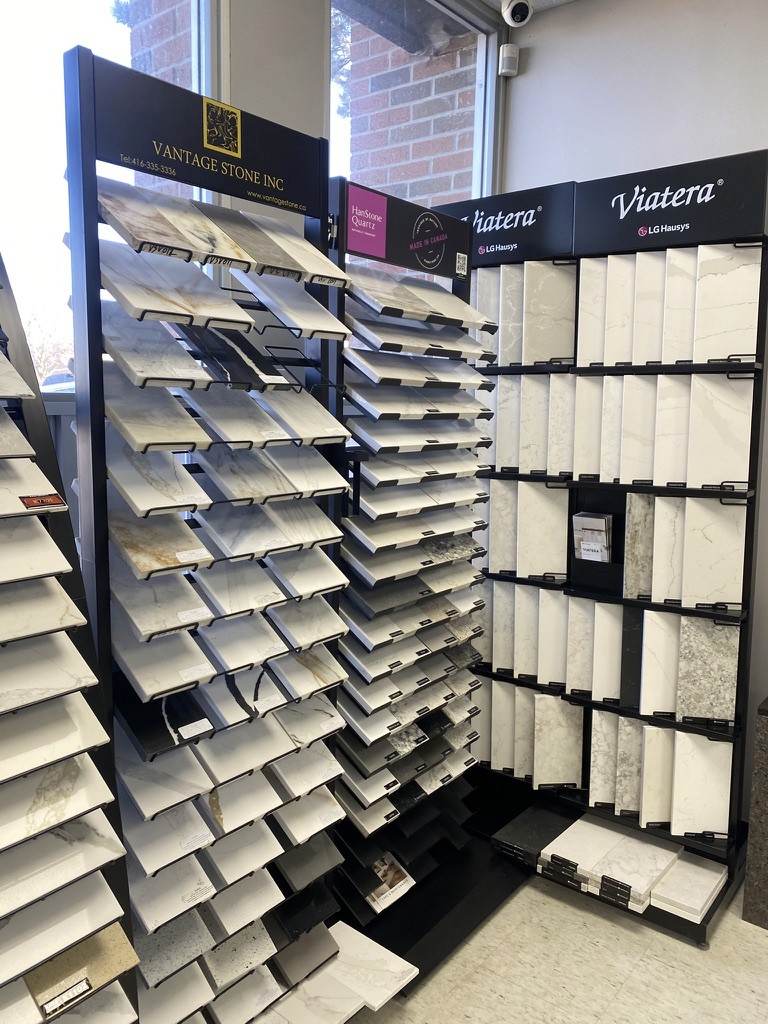
I led the interior design process, carefully selecting materials to align with the brand’s aesthetic. I considered every detail, from tile textures and paint colors to furniture choices like chairs and tables.


—— Key Learning
I led the interior design process, carefully selecting materials to align with the brand’s aesthetic. I considered every detail, from tile textures and paint colors to furniture choices like chairs and tables.
Design & Business Alignment
I realized that great design isn’t just about making things look good. It needs to serve a purpose. Whether it’s increasing engagement, reinforcing a brand, or making information easier to access, every design choice should align with business goals. Learning how to balance creativity with strategy was a game-changer.
Communication is a Part of Design
I wish I had focused more on communication—especially presenting my designs. It’s not enough to create good work; explaining the logic and process is just as important. I plan to improve this skill to better pitch and justify my design decisions in the future.
Time Management is Everything
Juggling multiple projects under tight deadlines was no joke! I learned to break tasks down, prioritize what matters most, and stay organized without sacrificing quality. Now, I feel way more confident handling fast-paced projects.